This is a moist zucchini bread made with brown butter, white miso, and dark chocolate. The miso adds saltiness and umami, while the brown butter gives the bread a rich, nutty flavor.
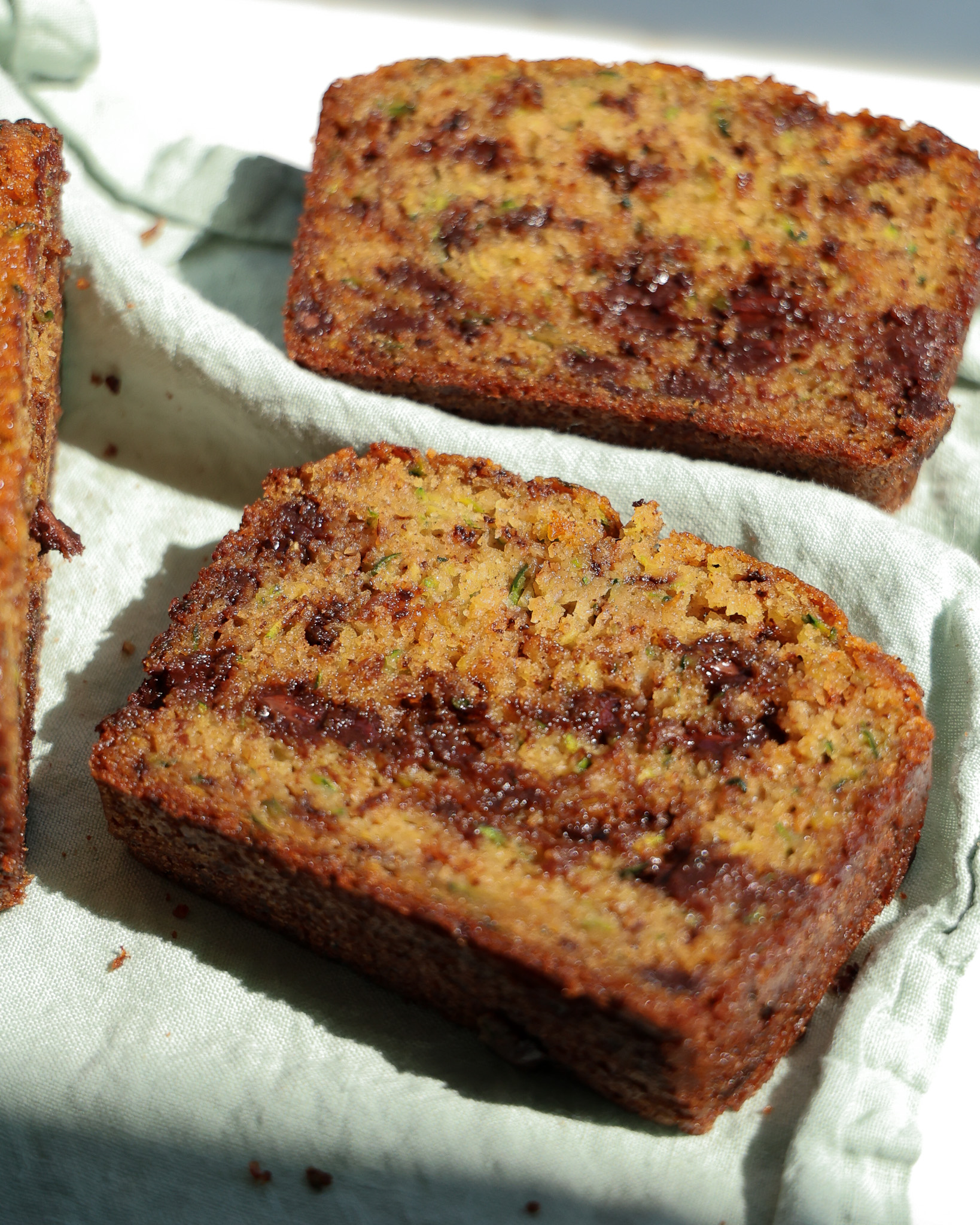
Recipe adapted from Justine Snacks.
I love this website because of the fun colors, patterns, and fonts. It feels very warm and friendly, which makes me trust the recipes more. It is also very simple to read and I like the brief intro at the top of the page that tells you cuisine type, cook time, a little about the dish, etc.
This website is even more fun with its fonts and colors! I really like the title, header section that puts the name of the dish really big at the top, and I appreciate the "jump to recipe" button.
This website is much cleaner than the others. It really only tells you exactly what you need to know, and it is designed in a very minimal but sleek way.
I just think this website is so clean and chic and easy to navigate. I like the amount of white space it has. It seems like they only add what is truely important.
I do think that this website could have slightly better contrast between the dark green background and the thin black text, but I like how when you scroll down, somethings move while others stay in place.
When I was working on creating my portfolio website, I kept looking at this one as an example. I just think it shows a lot of personality while being relatively simple. There is good hierachy and contrast, everything is very clear and easy to navigate, and it's just super cute.